
There are two main types of logos: typographic logos and Illustrative logos. Illustrative logos contain icons, abstract images, or other pictorial depictions of your brand. Typographic logos include the name or abbreviation of your business in a stylized way that creates your branding. Using one or both of these types of logo elements gives your business many options for its branding.
Typographic Logos
Typographic logos are also called logotypes and are font-based. Think Coca-Cola’s logo. This type of logo focuses on a design highlighting the business’s name. They’re often clean, simple, and memorable.
Although a typographic logo may seem simple and easy to slap onto a sign or business card, it takes as much thought and care as an illustrative logo. It can entail a particular font, a combination of fonts, entirely custom typefaces, embellishments like ligatures and swashes, and monograms.
Pros
A typographic logo can be a good option if you’re a new business trying to get your name out there. People will see your name in your logo and remember it.
- Good brand recognition
- Promotes brand awareness
- Little risk of brand confusion
- Classic
Cons
People may see a typographic logo and find it to be less creative or artistic than their illustrative counterparts.
- As font trends change, your logo could become outdated and less desirable over the years. For instance, the Google logo has evolved and changed to combat this.
- For a business wanting to promote an image of “fun,” logotypes can seem more traditional than creative
- Long business names can sometimes be awkward and don’t lend themselves as easily to typographic logos (although a “monogram” logo, using initials, may work well)
Who Should Choose a Typographic Logo
- Businesses whose names tell potential customers what they do (Gauley Whitewater Rafting Co)
- Brand new organizations who want to boost their name recognition
- Companies that want to project a classic or retro vibe
Illustrative Logos
An illustrated logo is a pictorial image/ brandmark that contains images or graphics and can also be called a logomark. An example of this would be the Taco Bell logo. That image of the bell is recognizably Taco Bell by almost everyone.
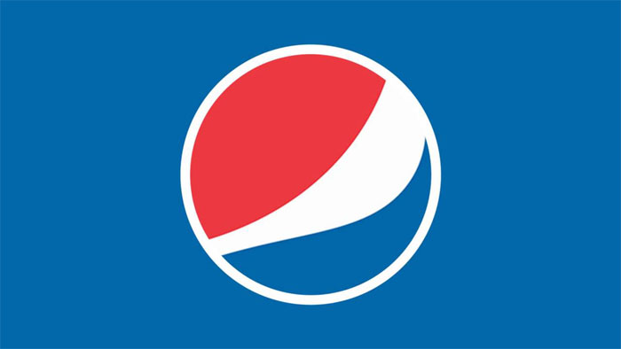
An illustrated logo can also be abstract. Think of Pepsi. It’s not an image of anything specifically. Instead, it represents the brand accurately without an obvious illustration of the products. This can be a great option if you’re looking for a simplified logo.
Pros
- An illustrative logo can be fully customized to fit your brand and be completely unique to your business
- Creativity can run wild!
- When your business name contains few or no clues about what you do, you can convey what your business is all about with an icon or image
- A compressed round or square illustrated logo is perfect for use in many applications where a typographic logo would be awkward
Cons
- Requires a designer’s touch to pull it off
- Can get over-detailed really quickly
- Better for businesses that already have some brand recognition (or plans for obtaining it)
- Illustrative styles can also go out of fashion and become outdated
Who Should Choose an Illustrative Logo
- Businesses with names that are recognizably related to animals or other physical objects, such as Apple’s Apple logo, or Twitter’s bird
- Organizations with names that don’t convey what they do; an illustrative logo can help explain what a business does
- Brands that already have a lot of recognition
While these can be used for any brand, it might be better for established brands that are already recognizable. When choosing an illustrative logo, the biggest thing is to select imagery that accurately represents your brand. Brands that make significant use of an illustrative logo generally also use a version of their logo that features their brand name. This leads us to the combined use of illustrative and typographic logo elements.
Combination Logos with Both Typographic and Illustrative Elements
A combination logo is exactly what it sounds like. It’s when you have both illustrative and typographic types of logo elements in your branding. For instance, most of the logos we design contain both the name of the business and imagery.
Pros
- Flexibility: you can choose to use your entire logo in places where you want to boost name recognition, but you can also use just your icon in certain applications, like a favicon and social media
- Conveys a lot of information about your business: your name and an illustration of what you do
- Can build name recognition so that you can later move toward an illustrative-only logo
Cons
- Can be harder to read at smaller sizes if there’s too much going on
- Logos that contain multiple elements can take more time to develop/design, and thus may be more expensive per round of revisions
- Just as with purely typographic designs, fonts can become stale after a few years, necessitating updates
Who Should Choose a Combination Logo
Brands that aren’t as well known may use a combination logo to raise awareness for their brand mark so that, eventually, they can just rely on that. Combination logos are highly versatile, meaning that whether you’re a new business or an established brand going through a rebranding process, a combination logo will fit your needs to create a unified design.
Need a logo but are not sure which direction to go in? Contact us and we’ll help you design an elegant logo that accurately represents your branding and business.


0 Comments